Guy Nevill of Birling Estate in Kent approached Ditto for a rebrand that would support the diversification of this 600 year old rural estate, with the goal to create an identity that would support their wine estate and unfolding hospitality venue.
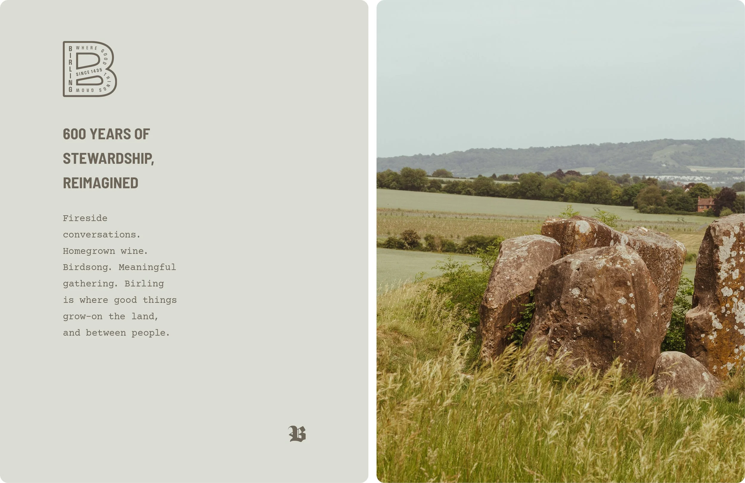
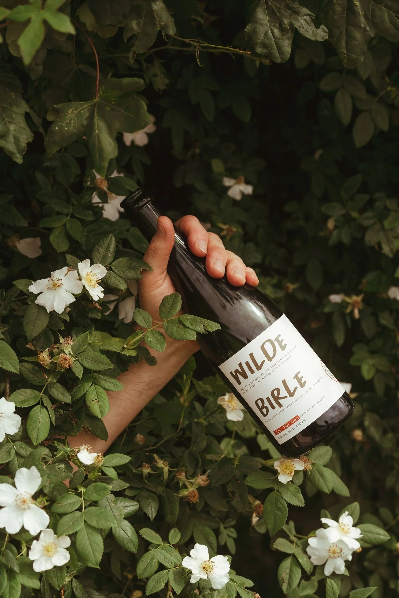
Tucked into the North Kent countryside, Birling Estate is 1,813 acres of ancient woodland, chalk meadows and farmland that’s been quietly getting on with things since before Stonehenge was even a glimmer in someone’s eye. It is a place which has seen a good deal of life, and yet is more interested in where it’s going next than where it’s been. We worked with Guy to reposition the Birling brand, create a fresh brand identity and launch their very first bottles of estate-grown wine.
The opportunity: a 600 year old estate in evolution
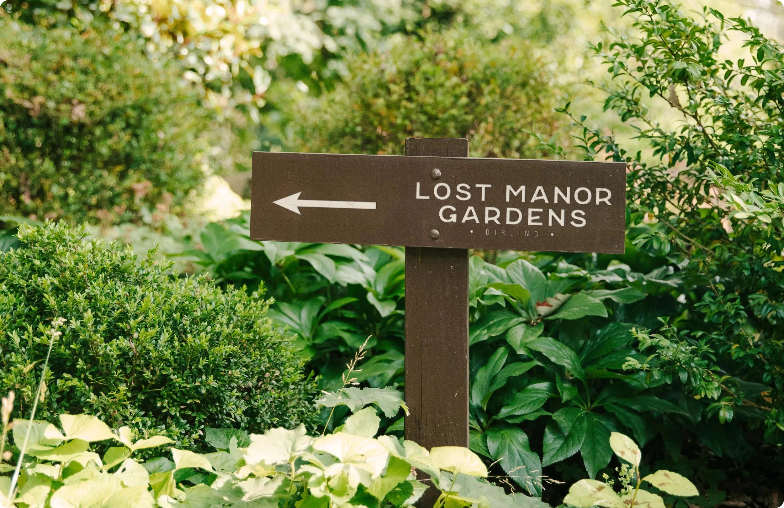
When we began a conversation with Guy, the estate already had various enterprises on the ground: Badgells (an award winning campsite), a sawmill (which produces all of the timber required for campsite structures - brilliantly circular), The Manor Gardens (a wonderfully off-grid venue for weddings and small celebrations), and an unfolding offering for corporate clients who wanted to spend a meaningful day with their teams in nature. Perhaps most excitingly, Guy had recently planted a vineyard, marking the first step in a 20 year ambition to produce wine from the soil of his family owned land.
Building the foundations: a place where good things grow
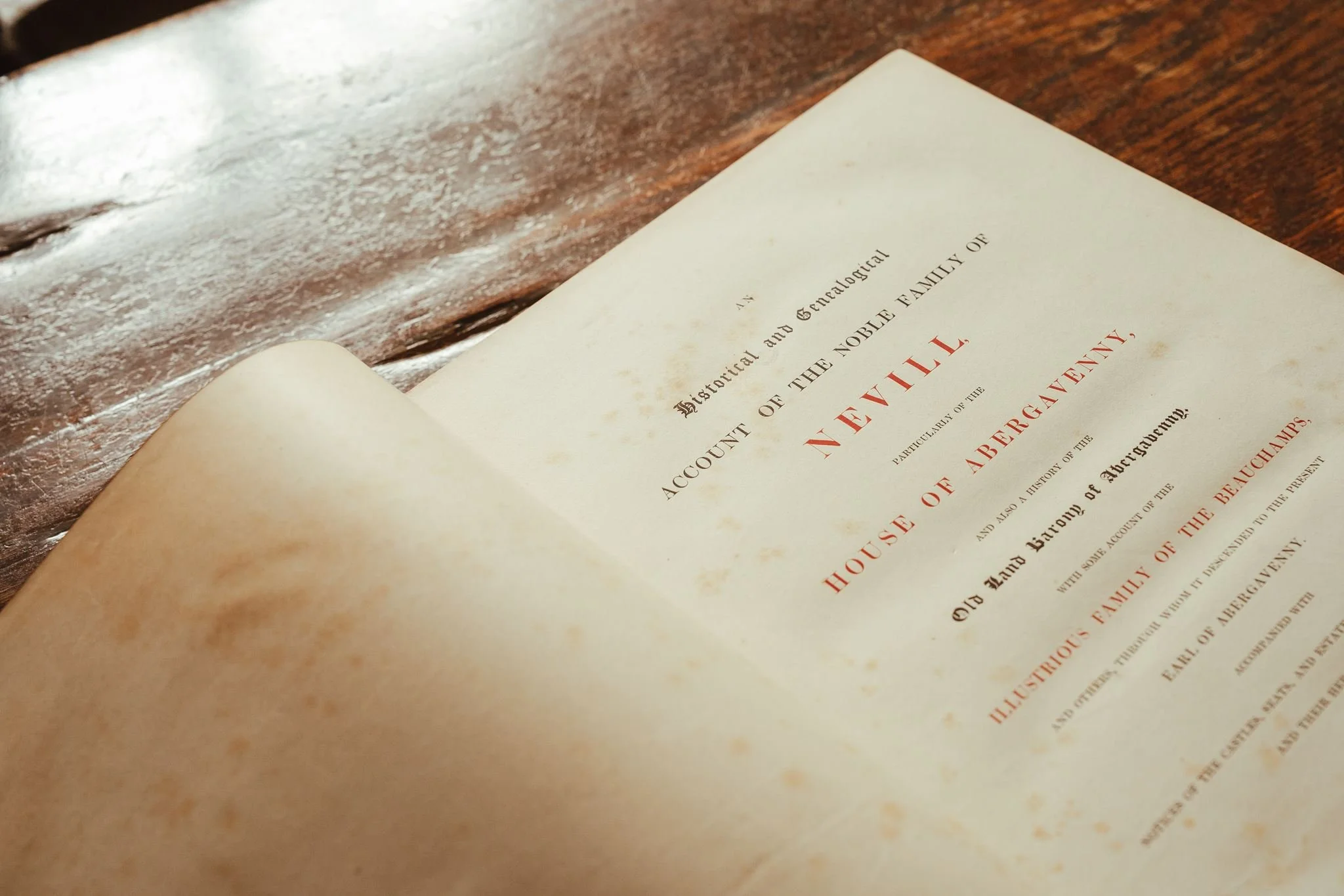
While there was lots going on at Birling, each strand of the business was competing for attention in its own right, resulting in a poor market presence and disparate messaging across all enterprises. Inspired by Guy’s philosophy of intentional stewardship, we recommended that all aspects of the estate were brought together beneath the umbrella of one clear parent brand, celebrating the diversity on offer from a single corner of the Kent countryside. We worked alongside Guy to arrive at firm brand positioning and language which reflects the estates’ authentic manner: warm, grounded, unpretentious and thoughtfully forward thinking. Guys’ own philosophy inevitably informs his approach to managing the land - inspired by the Nevill family motto ‘Ne ville vellis’ which translates to ‘no mean wish’, or ‘desire nothing dishonourable’. Guy has translated this as ‘kindness and beauty’; to do things with positive intentions, and to leave the land better than we found it. Such a clear philosophical steer informed the entire attitude of the brand, switching gears from what could easily have been a brand leveraging aristocracy to one which is warm, human and earnest in its intention.
Rebranding Birling Estate
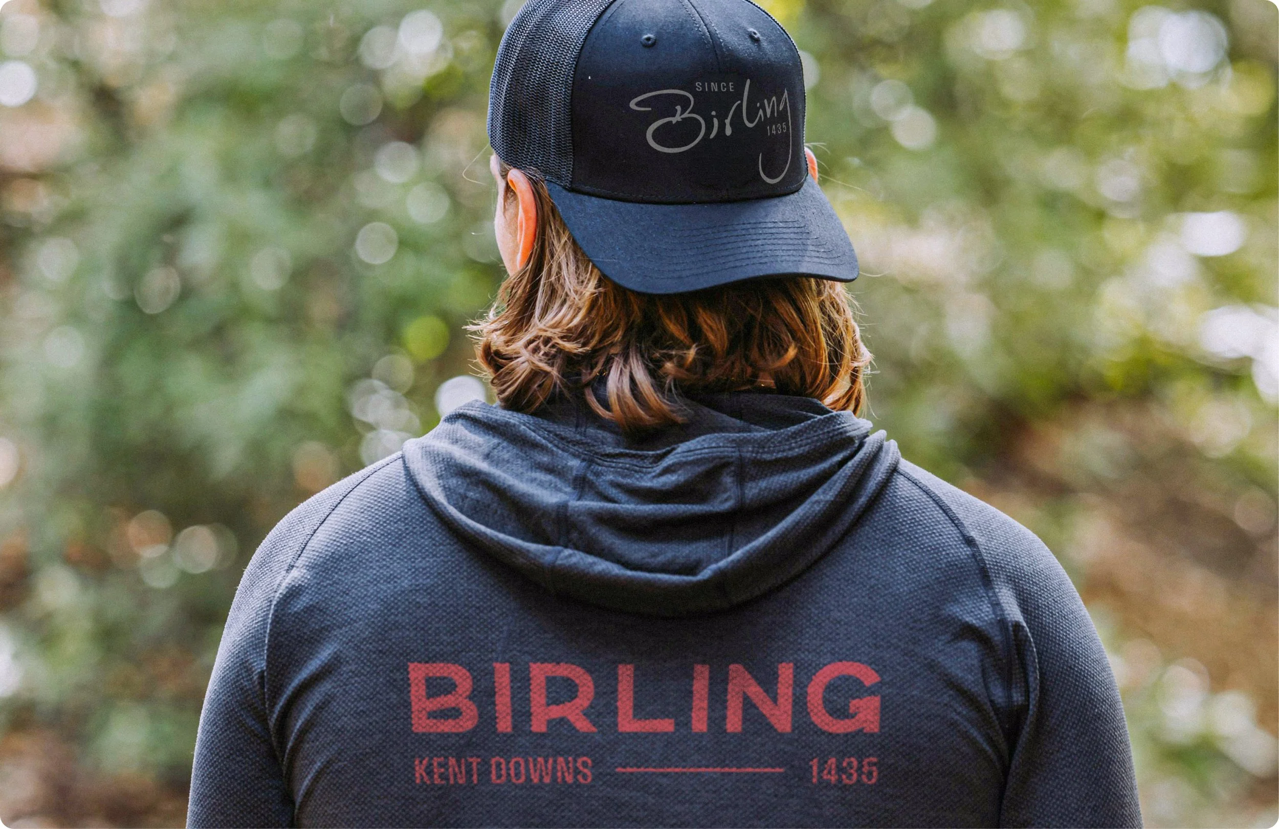
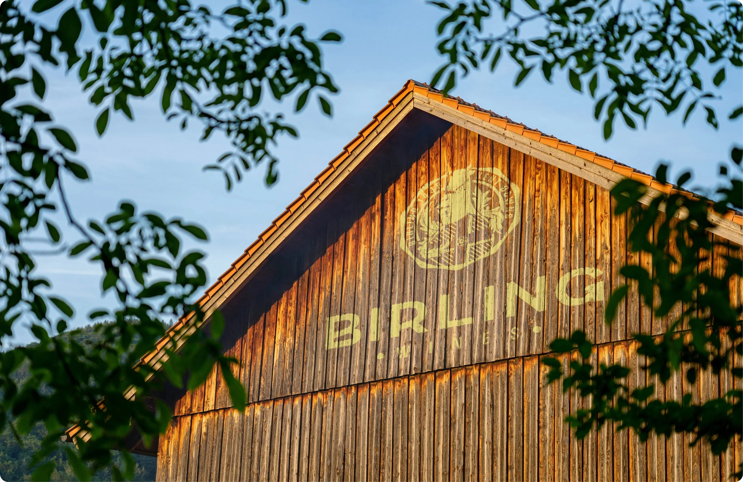
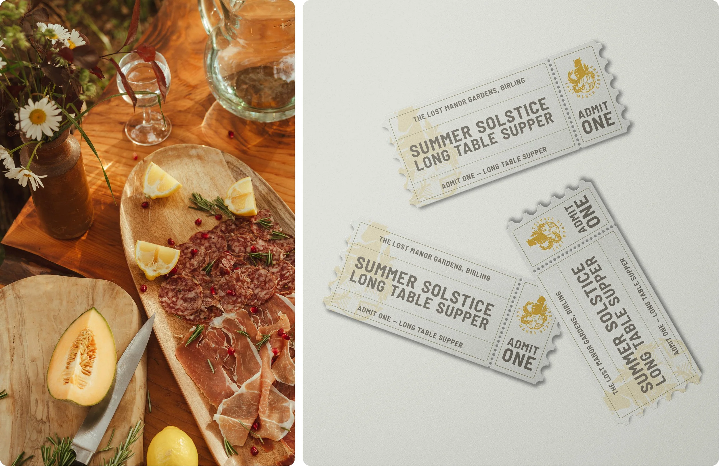
While some of the Birling enterprises had a level of visual identity, many had none at all - and the estates’ own visual style was underdeveloped. We created a complete visual identity and brand architecture for Birling Estate, considering each enterprise in its own right while ensuring that they sat alongside each other as part of a wider family. Each enterprise now has its own distinct badge, derived from the Nevill family crest.
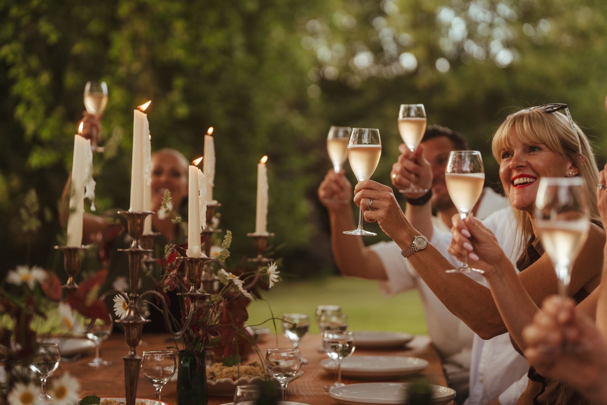
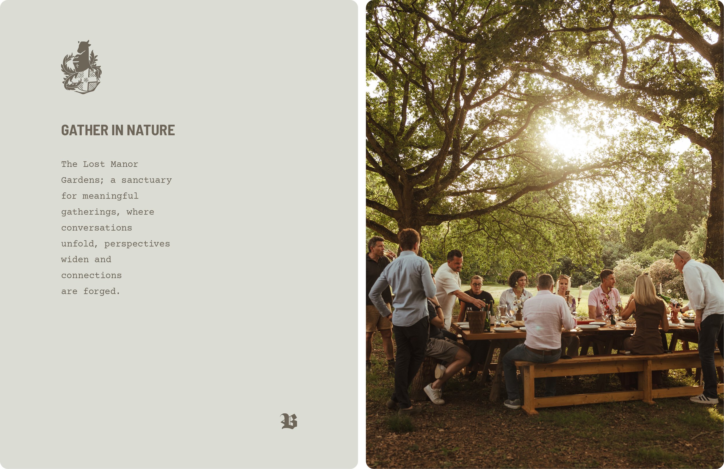
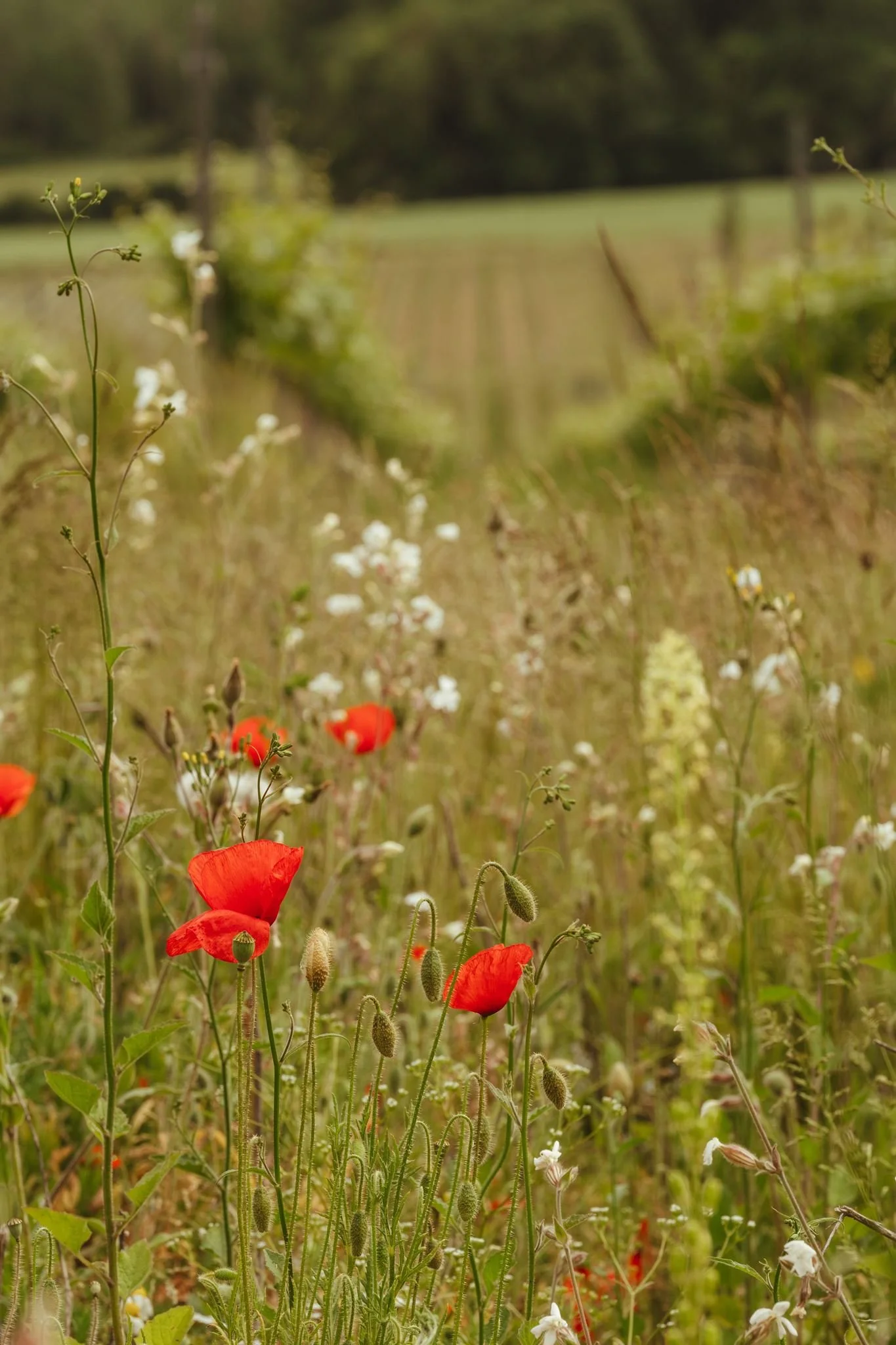
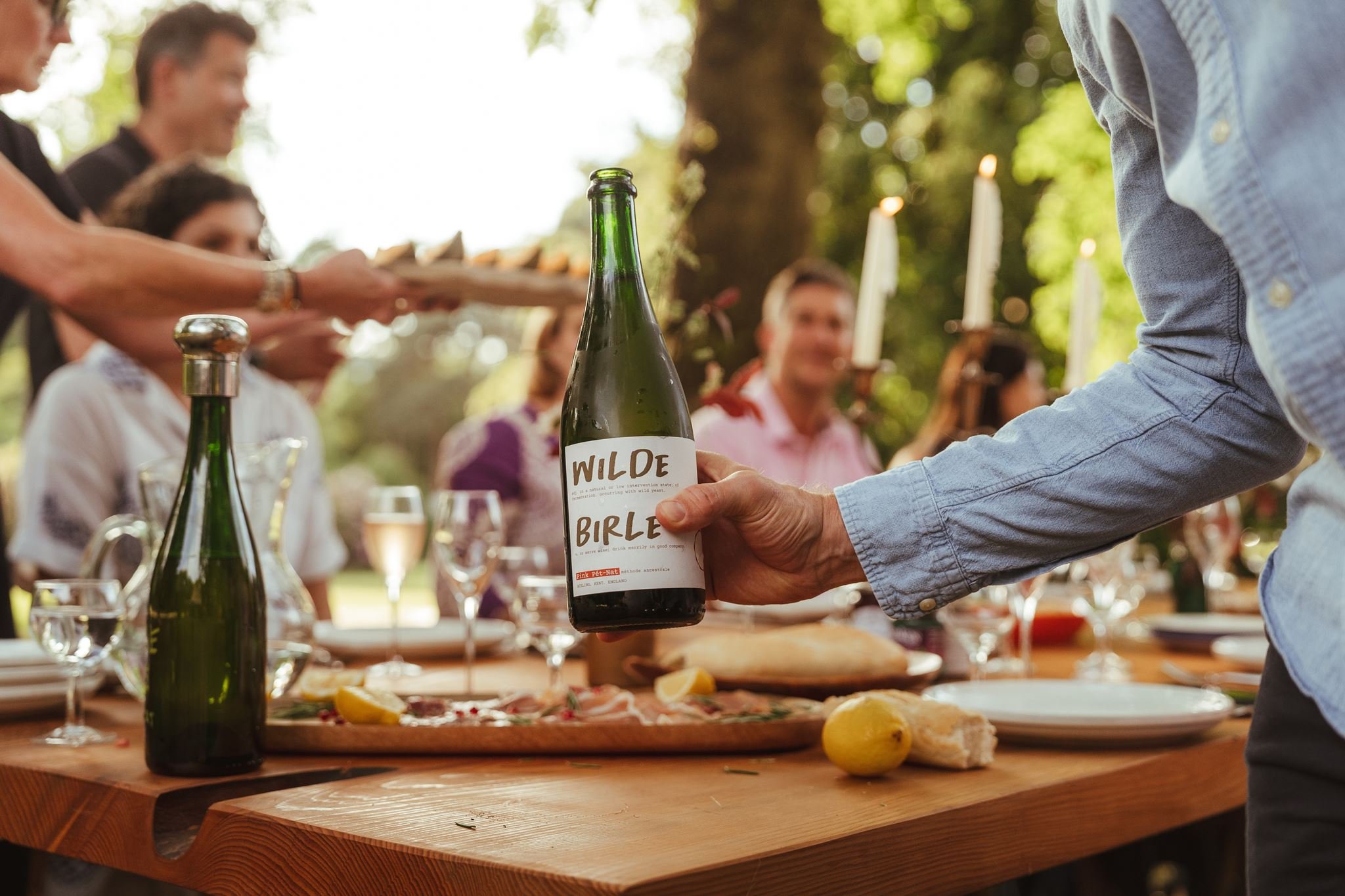
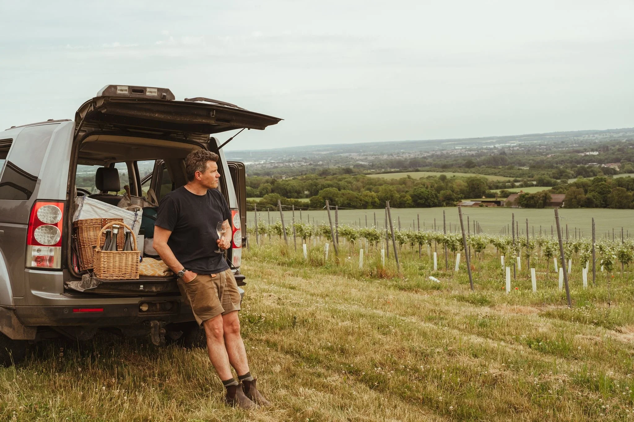
The story of the estate needed to be bought to life online, and to do that we needed to create a library of imagery that tells the story of the estate. Working with our long time collaborator Michael Jackson at Saltwick, we directed a full photoshoot and short film which beautifully illustrates life at Birling Estate. Planned to encompass all areas of the estate, we moved between the campsite, vineyard and Lost Manor Gardens, producing a comprehensive library that’ll populate the new website (currently under development) and social media.
What’s next
There’s plenty of opportunity abound for Birling Estate, and we can’t wait to see where the fresh trajectory of this rebrand takes them. If you manage an estate in need of diversification, revival or commercial uplift, we’d love to talk.