Bringing a brand to life: Crouch Butchers, Wadhurst
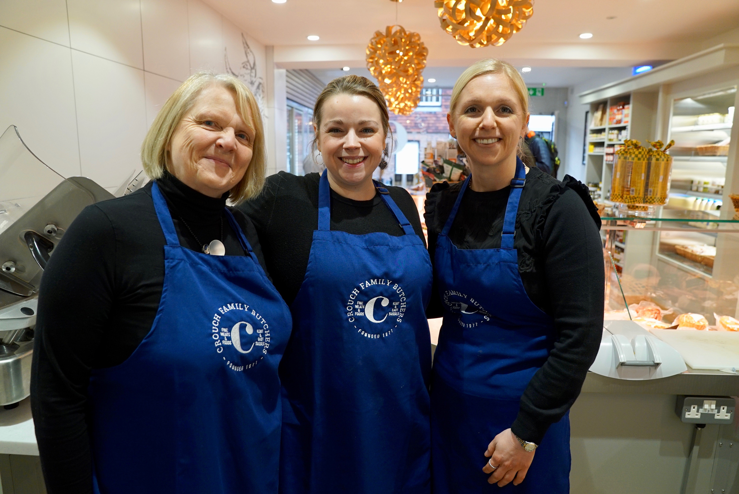
Do you remember the brand we created for Crouch Butchers last year? We worked with this brilliant family to craft a fresh brand identity that would celebrate their 40th year in business whilst setting them on a fresh path for the next phase of their business. And part of that was always going to include refitting their three shops to reflect their new look and create true foodie havens that would be a pleasure for customers to shop in.
After a two week complete renovation of their shop in Wadhurst, East Sussex, Crouch flung open their doors last Saturday and invited customers in to enjoy their new look. When I say complete renovation, I really mean a complete, total, utter transformation. Not a single shred of the old interior remained, and I'm still astounded by how much they achieved in two short weeks!
The aim of the refit was to create a really homely, kitchen feel. Too many modern customers are afraid to shop with a traditional butcher; they don't know what to ask for or how to buy meat that isn't presented wrapped in plastic. To overcome this, every element of the shop design had been very carefully considered. For one, the butchers' block was repositioned from the back wall to sit at the end of the meat counter, meaning that customers could see exactly what was happening and can now speak to their butcher as they work. Much easier to be able to point at what you want, right?!
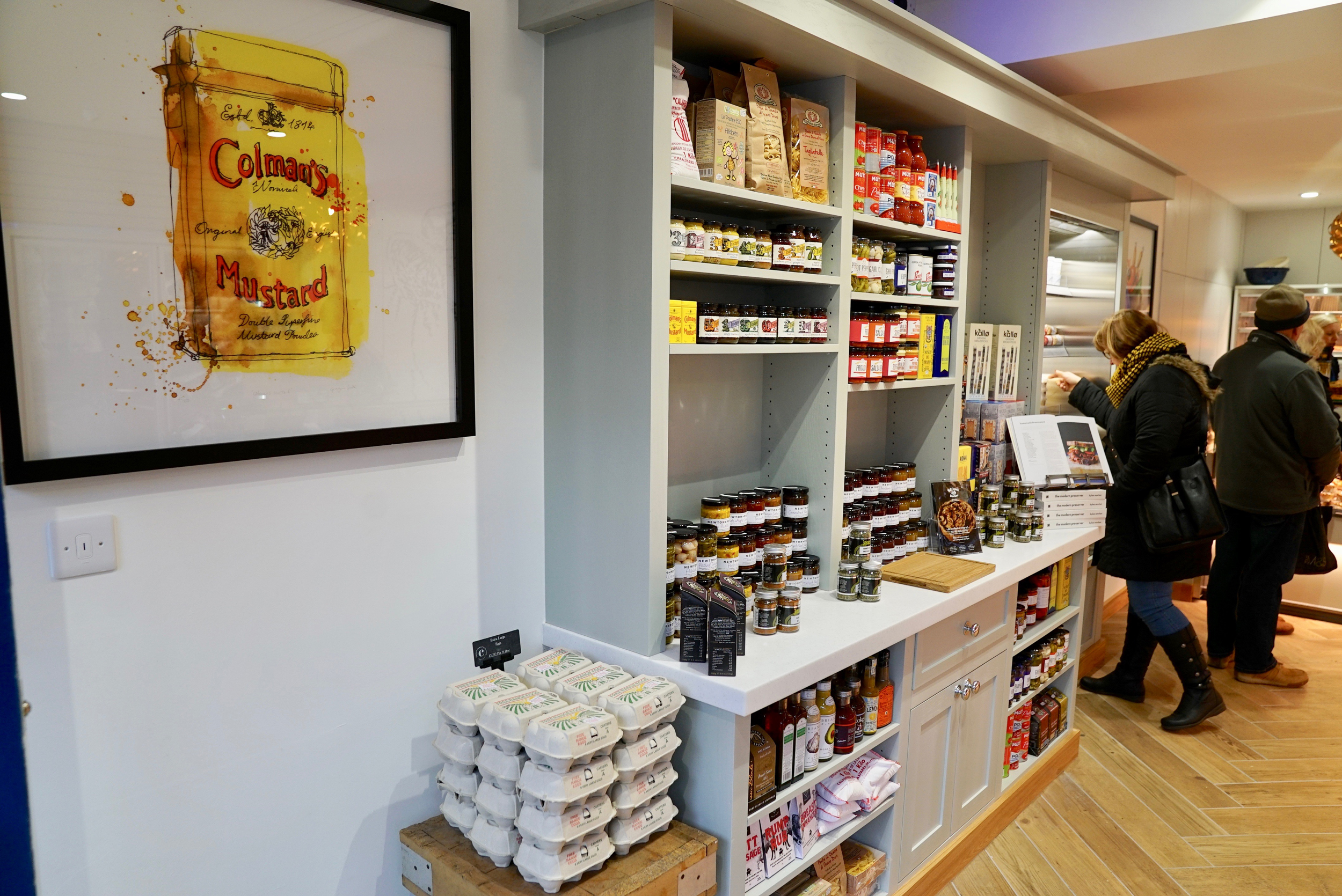
The kitchen shelves, painted in a gorgeous sage shade, have been stocked with produce that Lottie has painstakingly researched and sourced. From olives and home made pesto to pasta, crackers, sauces, marinades and condiments.... she's thought of everything.
The exterior of the shop looks amazing. Painted in one of their brand colours and with the logo proudly emblazoned across the window, you can't miss it. Inside, it looks even better! Continuing with the home kitchen feel, there's pale wood flooring, massive white tiles and white counters. This is set off perfectly with lighting by Tom Raffield and two gorgeous custom prints by local illustrator, Georgina Luck.


