
Proud to Present: A countryside inspired brand for Round Wood Distillery

I love Emily and Rupert from Round Wood Distillery. Whether it was their warmth and infectious enthusiasm, their uncanny similarity to two dear friends of mine or the fact that they bought their dog with them to our first meeting, I think they're fab. They approached us at the beginning of their business journey, as they prepared to set up a gin distillery in a converted cowshed on their Cambridgeshire farm. Here's their story...
Passionate, ambitious and loaded with character, Round Wood Distillery will be a new and exciting gin distillery for fellow gin lovers. The gin market is exploding right now, which makes it a brilliant time to launch a distillery– but it also means we need to work a little harder to find their niche and be distinctive.


There’s oodles of scope for this brand. From creating limited edition bottles using ingredients foraged from the hedgerows to running gin experience days and touring the country in their converted Defender, there’s so much potential to evolve.
Round Wood Distillery provides customers with a slice of the good life and a taste of the countryside idyll. Warm, witty, down to earth and unafraid of hard work, this is a brand for people who love to buy quality products from independent producers. We anticipate that Round Wood's customers are likely to be a lot like Emily and Rupert themselves - warm, welcoming and full of life. They’re curious people who love to try lesser known brands – and they’re keen foodies, too, always seeking out unusual and lesser known producers. More likely to buy a bottle of gin to share with friends rather than to add to their collection, they adore brands with a story behind them. While not necessarily living in the countryside, they’re attracted to that way of life and aspire to lead that kind of lifestyle – earthy, simple and heaped with character.


The season personality
Grounded, passionate, earthy, honest and rooted in the countryside – the season personality for Round Wood Distillery could only be Autumn.
Autumn personalities are insanely sociable and make friends easily. They’re practical, hands on and unafraid to roll their sleeves up to get the job done. They’re relaxed, informal and offbeat. Autumn brands are strong, substantial and bold. They’re quirky, unusual and the absolute opposite of commercial, mass produced brands.

The brand
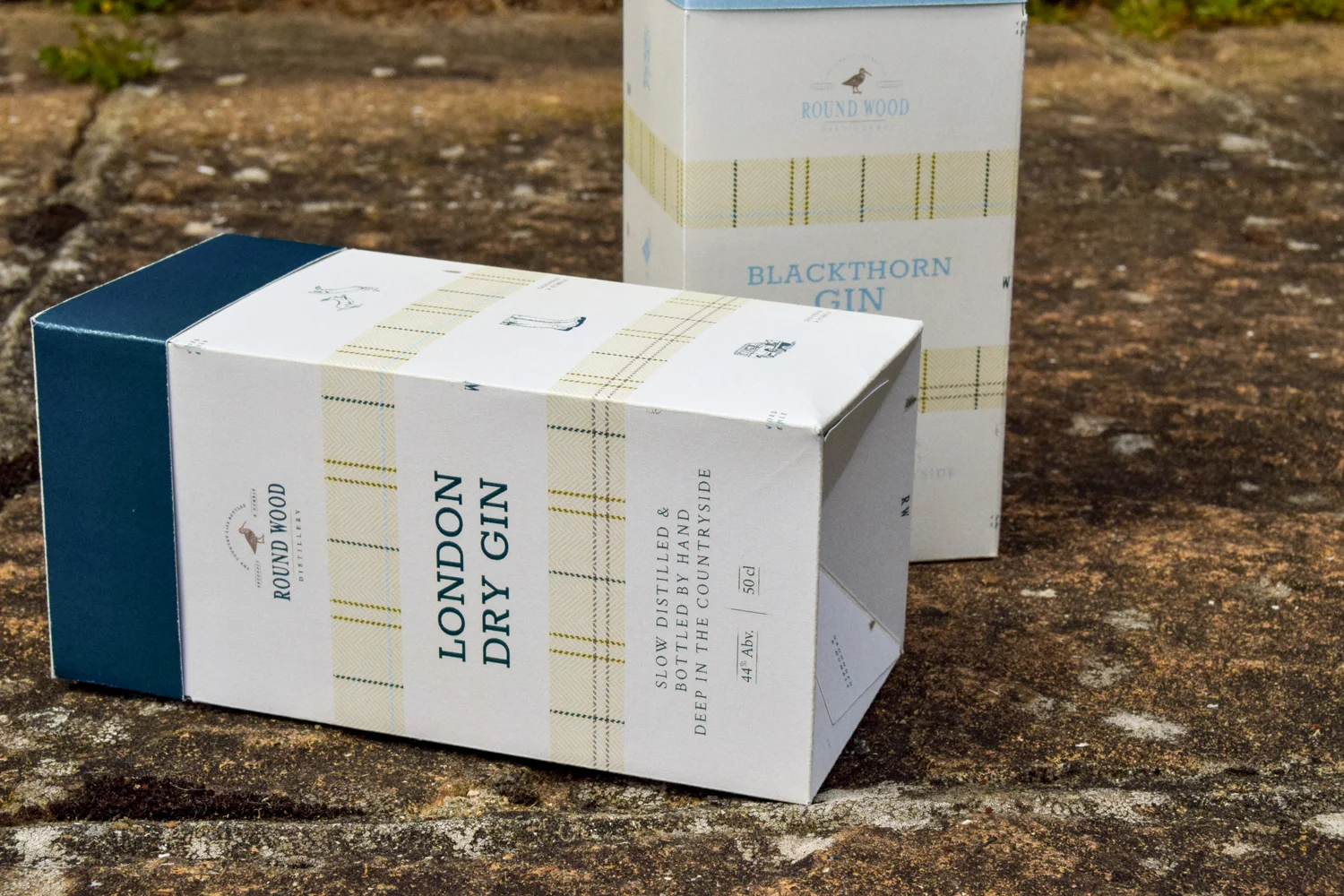
Inspired by the British countryside, this board feels mellow, warm and welcoming. It also feels unexpected for a gin brand, which is ideal!
There’s plenty of substance, texture and character to this brand. Natural textures such as wood, hessian, brick and stone feature heavily for a rustic and undone feel. Slightly weathered elements add an element of imperfection that creates a welcoming feel. Hand lettered scripts feel approachable and personal.
Typography is a combination of characterful serifs, unusual slab serifs and fonts with a vintage twist for a hit of nostalgia. We adore the hand drawn illustrations – the defender and the gorgeous hares lend that countryside feel beautifully. The colour palette for this brand is an absolute beaut. Softer than most autumn colour palettes, it has a refined twist to it that leans towards quality and tradition. It's rich, abundant and earthy.
Emily and Rupert certainly don't hang around; within a couple of days of receiving their brand files they'd launched a web holding page and instagram (how amazing does their secondary logo look on their profile, by the way?!) which I will be avidly glued to as they prepare for their official launch!