Proud to present: a refined and elegant brand identity and website for Italian property expert, Joe Thompson

The variety of clients we work with never fails to amaze me. Joe Thompson is an expert in Italian property, and despite spending a good chunk of time living in our home county of Kent he now lives in the sunny climes of Cortona in Italy, where he works with clients on creating the most incredible estates (when we began our work together, he was working with a client to create a vast vineyard and wine estate - it hardly sounds like work really, does it?). Joe knows the Italian property market inside out; in a challenging and complex market he has the knowledge, the contacts and the experience to navigate what can be a bumpy journey and protect his clients’ investments and best interests. He is at once a project manager, friend and ally.
While the nature of his work is such that clients learn of him through word of mouth, Joe felt that his presentation needed to be smarter. This process was not about marketing, but creating the face for Joe’s business that it deserves, distilling his message within a cohesive brand identity which echoes the personality of his business truthfully and beautifully. It was about unequivocally putting his business in a league of it's own and providing Joe with a platform upon which he can elevate.
Though Joe’s clients are undeniably affluent, his brand personality is humble and warm. His brand is sophisticated, refined and polished yet without the merest whiff of arrogance. Grounded and solid with an unwavering strength, it's a business that people can put their faith into. It's dedicated, hard working, efficient and trustworthy. It's well-mannered, personable and relaxed – yet with a core of steel that remains focussed on the task at hand and devoted to achieving its goals.
Joe & Co is a brand which is sincere, respectful, warm and welcoming. It is quietly confident, thorough and has an air of quality which invites trust. It's an aspirational brand, where exemplary standards and ethics are a given and clients are greeted as friends and partners. To echo these values, we needed a brand which was both polished and warm.


The brand
The Joe & Co brand features timeless typography, dramatic shapes and evocative imagery. It’s a brand which evokes the elegance of the Italian spirit, hinting at heritage whilst feeling modern, decisive and rich. A colour palette inspired by Italian icons sets the scene for a brand which is subtly infused the the essence of the Mediterranean, infusing the brand with depth. Hand illustrated landscapes add character, and elegant typography provides the flair and strength that invites trust.


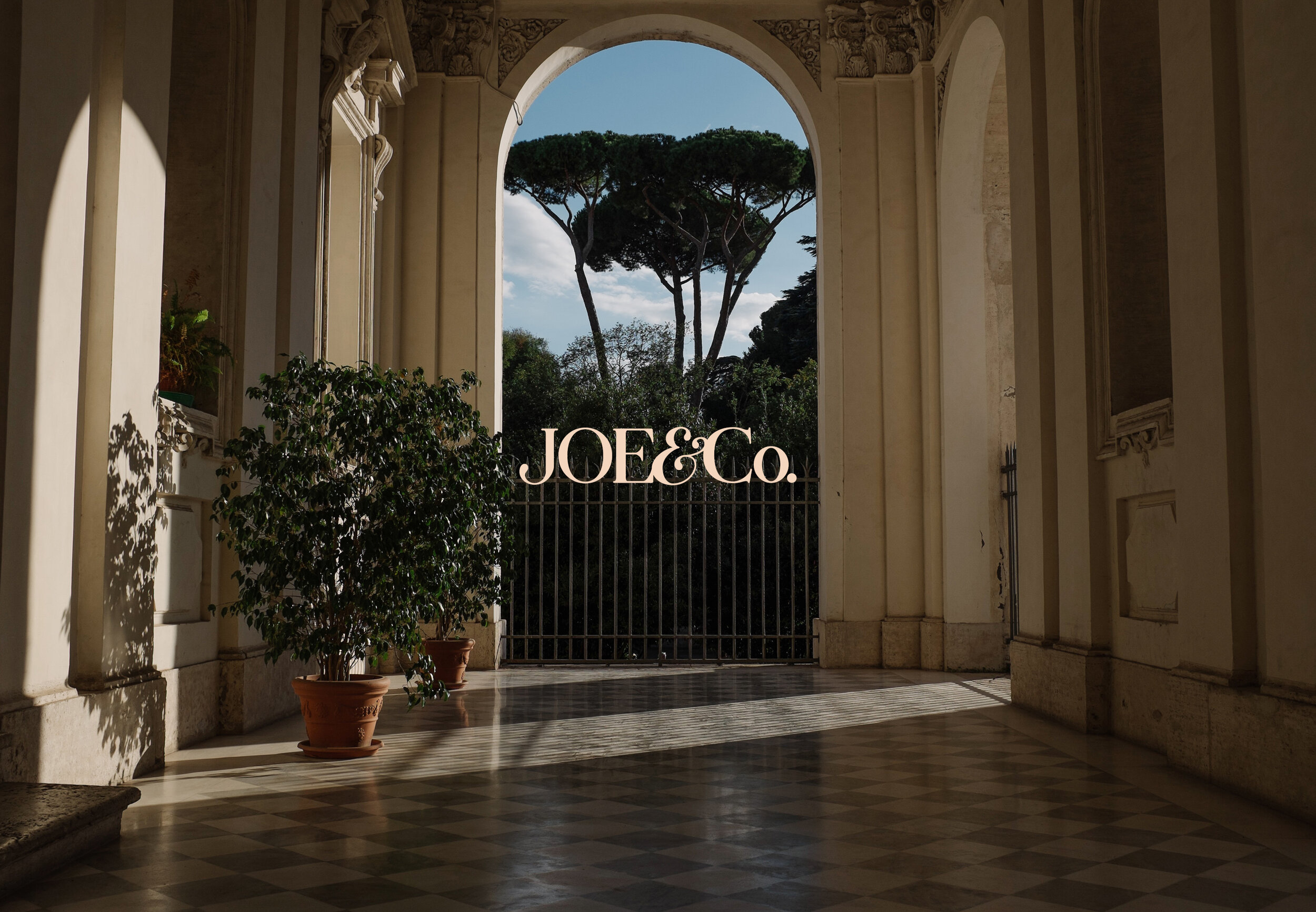
The photography used throughout Joe’s brand is a blend of images taken by Cat Vinton along with those sourced from Unsplash. I know people often feel that when it comes to brand photography, to do it properly you ought to hire a photographer for absolutely every image you use to represent your brand. And while in an ideal world that’d be true, it’s not always practical (or affordable!). I firmly believe that there’s nothing wrong with using a blend of commissioned brand photography and stock photography, provided that the images are of the same style, tones and mood. Cat had taken some beautiful interior shots for Joe & Co, but I knew we wanted the drama of rolling landscapes, and found exactly the right thing on Unsplash. You’ll notice plenty of green-blue tones in the images, and warm light; searching for that common theme means that the images fit seamlessly together.


With the brand in place, we moved on to creating a website for Joe & Co. This website was always going to be a minimal one; it doesn’t need to do the hard selling in the way that most do, and simply needed to reinforce the ethos and message of the brand. We chose a single page design, interspersed with plenty of thoughtfully chosen images and just the briefest descriptions of Joe’s services - far more elegant than a big website. I’m so proud of this brand - I hope you like!