

Proud to Present: A sunny, happy brand for jewellery brand, Joy

Aimee and Catie are quite possibly the sunniest pair of ladies I've ever met. But if there was any doubt for a second that those of a sunny disposition aren't equipped to get things done, these two put that to bed in an instant.
Aimee and Catie are busy mums with successful careers. Both born in South Africa, Catie now lives in the UK and the two of them have built their business, designed their ranges and created their vision via whatsapp! With just the occasional visit to the UK when it's absolutely needed. Fortunately, we managed to plan our meetings around Aimee's visits to the UK and it was an absolute pleasure to have them here as the branding process unfolded.
Keen to get their message and proposition right from the very beginning, the Joy ladies hired us to help craft their key message, define their values and build their brand story before we moved on to the design phase. Gaining this level of clarity from the start is so incredibly valuable; it gets everyone focussed and provides the much-needed support that we provide as experienced entrepreneurs ourselves.
So, I'd best tell you all about the Joy brand then, hey?
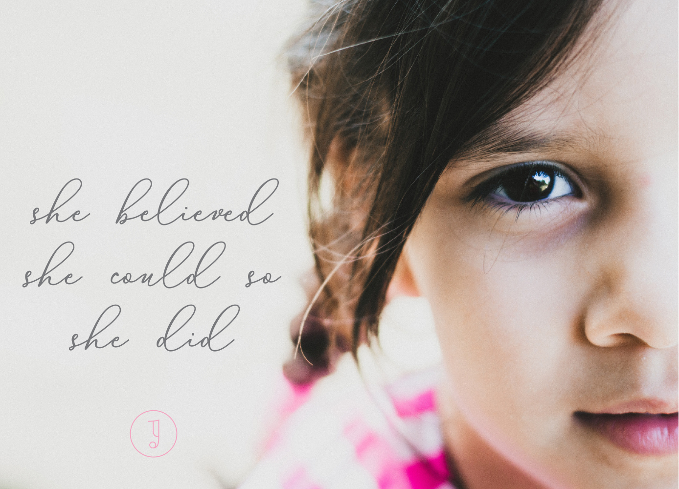
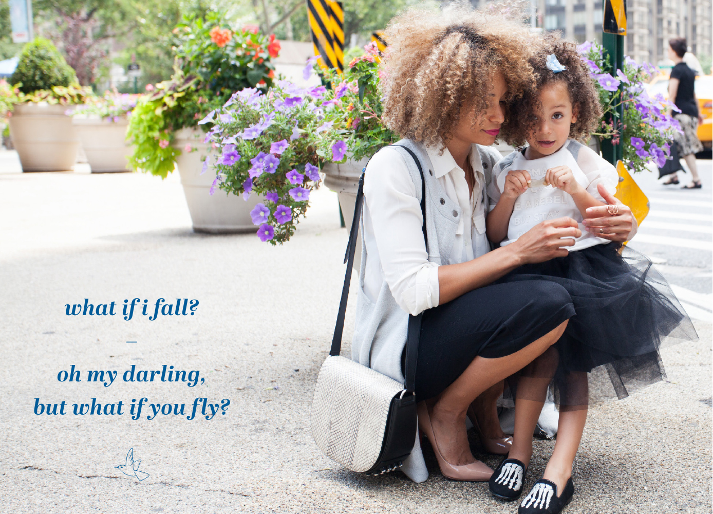
Joy is a brand inspired Inspired by Aimee and Catie's love for their children, and the desire to create a symbolic representation of that connection. They had the idea to create an aspirational range of jewellery for children ages six to sixteen years of age that tells a story and sends a message, inspiring hope, courage and strength in the wearer. They've also designed a few pieces for women, creating a set of jewellery shared by two people who care deeply for each other.


Bridging the gap between fine jewellery and costume jewellery, Joy pieces are beautiful, colourful, fun and mix high quality materials in an unexpected way for distinctive designs unlike anything else. They provide a burst of energy and colour; a reminder of all the good that life has to offer and something that represents love, fun, togetherness, hope and empowerment – not just for the wearer, but for the people and by extension, the communities involved in creating them.
We exist to celebrate life, love and relationships through beautiful, meaningful jewellery. We encourage our community to pause to smell the roses, to be grateful of those around them and to never miss an opportunity to express love, support and gratitude. We believe that jewellery is not about adornment, and not just an expression of style but about passing on the courage, hope and strength that inspires the next generation to blossom and reach for her dreams.


The season personality
The season that best reflects Joy is Spring. Spring is a bright, lively season; fizzing with energy and bursting with life, she’s irrepressible. Spring personalities love to see the lighter side of things and their optimism is infectious, inspiring those around them. They’re uplifting, creative, spontaneous and a ball to be around. Spring is a youthful season and moves quickly: not one to ever stagnate, they keep their finger on the pulse and are always on the hunt for the latest trend.
While Spring is undoubtedly the season that best represents Joy, there’s also an element of Summer that brings a sense of grace and balance. The duality of these two seasons works perfectly given the ethos of this brand; if Spring is the youthful energy, Summer is the nurturing influence that’s quietly supportive. Summer personalities are stylish, graceful and intuitive. Motivated by quality and style, the influence of Summer brings an aspirational and luxury edge to the brand.


The brand
I love this brand! It makes me smile every time I look at it. A riot of colour, it’s full of energy, life and vibrancy.
There’s plenty of movement: from beautifully expressive hand lettered scripts to italic serifs and the big, bold patterns which are softened by being in watercolour to prevent them from feeling too naïve.
Shapes and illustrations have a lightness to them; fine lines prevent anything from feeling too heavy and retain a sense of brightness and optimism. Despite the wealth of colour, there’s also plenty of white space on the board for an aspirational feel and a sense of space that provides a premium nod.
On to the colours. Aren’t they brilliant?! The colour palette has been pieced together with consideration given not only to how the colours work together, but also for their individual properties and what they bring to the party. We started with a classic gold for warmth and the sparkle you’d associate with a more premium brand. Moving on, primrose yellow is happy, bright, optimistic and playful. Blossom is soft, nurturing and gentle while a brighter peony inspired shade of pink is feminine, strong and confident. A succulent inspired turquoise brings a sense of creativity, clarity and freshness. Lobelia blue is trustworthy, intelligent and sophisticated, while graphite grey provides a practical base colour.
Catie and Aimee had their official launch in South Africa last week and were so kind to share some images with us. The event was an absolute sell out which comes as no surprise! I can't wait to see where their business takes them - they deserve every success in the world.
