Proud to Present: an inspiring brand for The Other Hive


Not for the first time, this project was one that crossed time zones and continents! Janet Hall and Leanne Powell set up their business via Skype calls and countless emails. While Janet lives just a few miles down the road in Kent, Leanne lives in Nairobi. Not to let a silly thing like distance stand in their way, this duo approached Ditto at the very start of their entrepreneurial journey, before their business even had a name.
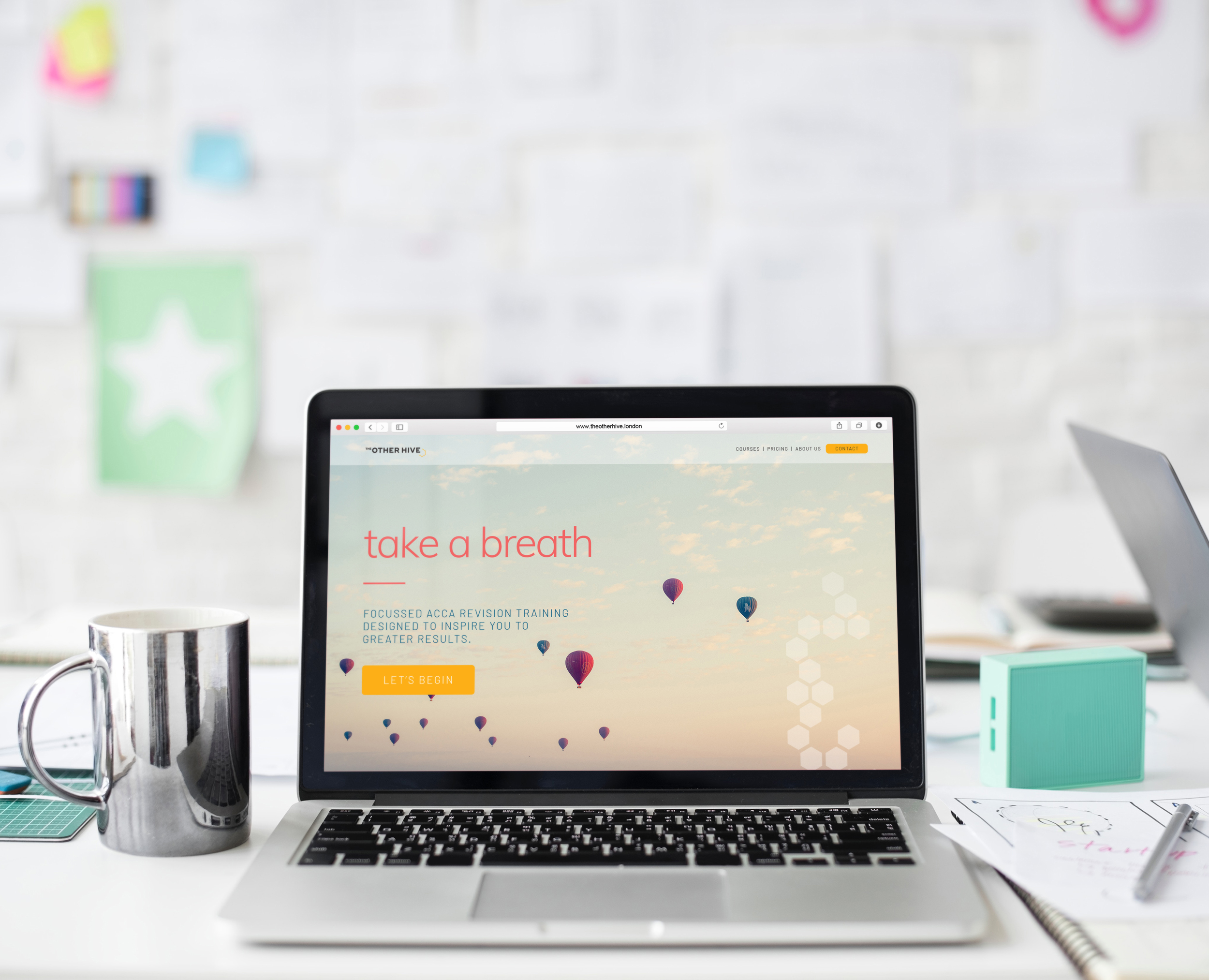
The Other Hive is the culmination of Janet & Leanne's collective careers as accountants and trainers. Driven by an overwhelming belief that learning shouldn’t be such a struggle, The Other Hive provides a new way to ace the ACCA accountancy exams and a fresh alternative to revision training, offering a focussed, simple way of learning that cuts to the chase and better fits with modern lifestyles.
The magic of The Other Hive is their lively, inspiring tuition that brings personality to the online classroom and puts the student first. They invite students to engage one to one, creating an environment where they can study to the absolute best of their ability. It’s all about lifting the weight from students’ shoulders to help them see more clearly and overcome their obstacles to success.
There are plenty of other companies providing the same service, but Janet and Leanne spotted a gap in the market for training that really engages with the student and is delivered with a level of energy that makes things happen. Turned off by the boring and bland offerings out there, they wanted to create something different that brings the human touch online.
Our first task was to find a name for this new business. Having explored a number of avenues and concepts, we arrived at The Other Hive, which everyone loved! With that in place, it was on to the brand.


Colour Psychology Season Personality
The seasons which best represent The Other Hive are Spring, with a Winter subordinate. Spring represents The Other Hive best; Spring personalities are light, bright and endlessly energetic. They’re warm, caring and very people focussed. They are natural communicators, and have an ability to instil an air of simplicity into almost anything. They’re adaptive, and able to think on their feet. Spring personalities possess an irrepressible energy that inspires and motivates those around them, breeding a sense of positivity that’s infectious.
Winter personalities meanwhile, are naturally very efficient and disciplined, with a talent for clear thinking and logic. They never lose sight of their objectives, and won’t let you down: if a Winter personality tells you they’ll do something, you can consider it done. They’re able to see the broader picture without missing a single detail, which makes them talented leaders and teachers. They’re decisive, practical and strong.


Whilst Spring reflects the sense of lightness, personality and energy that’s so inherent within The Other Hive, Winter provides the sense of strength and confidence that reflects their expertise and vision.
The season personalities influenced the design, as you'd expect - but they influenced the name, too. We wanted a name that fitted with the Spring element of their name - he idea of coming together, creating a place for collaboration and learning, and above all, a sense of offering something very different to everything else that's out there.


This brand is bright, lively and full of life. The lightness, energy and clarity of Spring meets the precision of Winter for a brand that is most certainly unexpected for your industry. Everything has a sense of light to it, from the bright, relatable photography to the gorgeous colours, creating a positive, can-do feel.
Typography is a blend of clean, contemporary san serifs with a rounded feel, upper case bold san serifs and a brilliant hand lettered script that adds a dash of character and a whoosh of energy. We love the simplicity of the monoline illustrations and icons which feel modern and don’t take themselves too seriously.
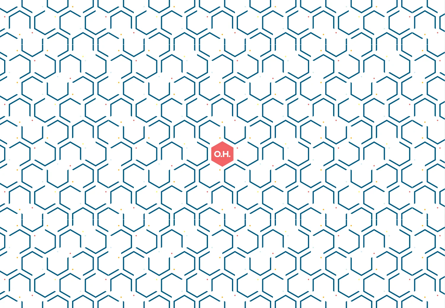
The overall feel of the brand is strengthened with geometric shapes. Inspired by the business name (yet not wanting to fall into anything cliched or predictable), we were drawn to the idea of tessellating hexagons that create an impactful design and invite the use of colour.
And the colour palette! So bright and bold, SO unlike the competition. Each of the colours have been chosen not only for the way they harmonise together, but for their individual properties. Black is serious, strong, powerful and decisive. It grounds the palette and enables us to have a little more fun elsewhere without things straying into the playful or frivolous category. Denim blue is intelligent, logical and trustworthy. Breeze blue is calm, soothing and forward thinking with a sense of clarity to it. Lemon is fun, lively, optimistic, happy and confident. Clementine is sociable, friendly, energetic and passionate. Finally, pomegranate is nurturing, compassionate, supportive, gentle and warm. Visually, it packs a punch and adds oomph to the palette.

We were absolutely delighted to be able to time Janet and Leanne's Brand Reveal to tie in with Leanne's brief trip to the UK - so wonderful to have them both in the same room for the big moment when they got to see their brand for the first time. This incredible pair are marching on with plans to launch their business imminently, and I can't wait to see what the future holds for them.