Proud to Present: a beautifully feminine brand identity for iconic beauty product, NuNale

The best thing about what we do is the diversity of the businesses that we work with. It keeps us on our toes, means we're always learning and makes things very interesting. And whether we're designing brands for hard working solopreneurs or bigger, established business, the challenge is always different!
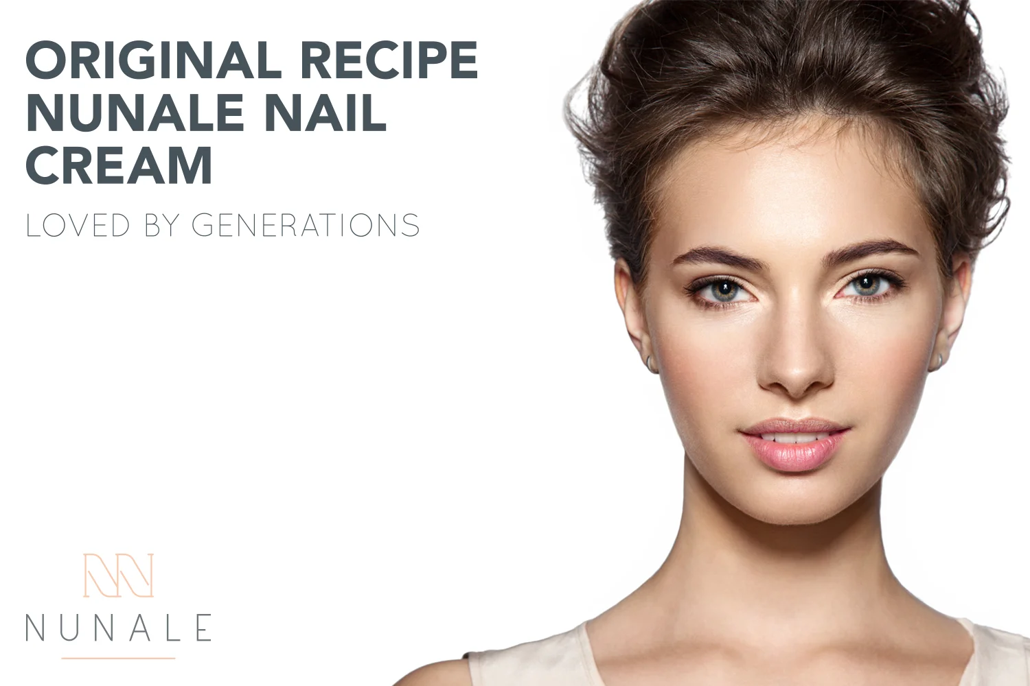
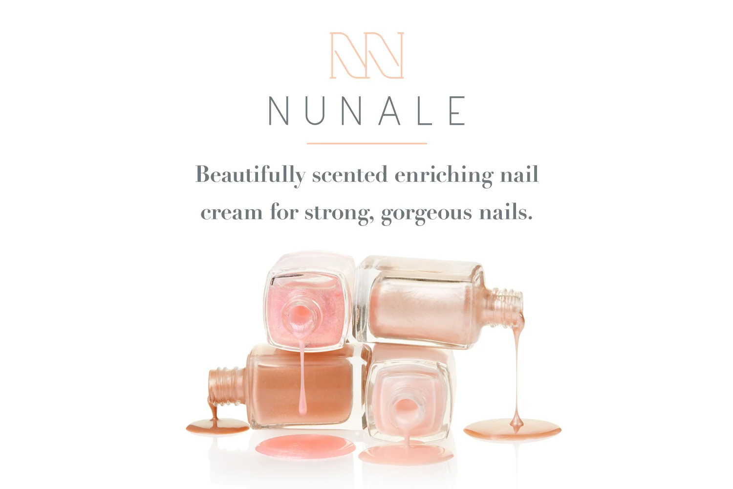
NuNale is a moisturising and strengthening nail cream that was created in the early 1950's. Over the years, the brand has become a cult product and attracted an incredibly loyal fan base who rave about how great the product is at strengthening and curing brittle, split or damaged nails.
With a strong track record and established history, this is a product that has a strong platform to sell exceptionally well. However, the packaging and brand identity needed serious help! With a distinctly 60’s feel to it (and not in a good way), the brand feels flat, dated and distinctly uninspiring – and that's why the team behind NuNale approached Ditto. In the pic below you can see precisely why the brand needed our help...

The aim was to rebrand NuNale to create a fresh and exciting look that’s relevant to a younger demographic, without alienating the core customer base. We started by spending a good chunk of time exploring the brand; its values, personality, and what makes it so special. We then turned our attention to the typical NuNale customer - who are they and what motivates them to buy?
We decided that NuNale customers range from exceptionally loyal older customers who have used and loved NuNale for years, to younger customers who discover NuNale for the first time and fall in love with it for its effectiveness and simplicity.
The season personality
The seasons which best represent NuNale are Summer and Winter. Summer brands are dependable, efficient, elegant and graceful. They are nurturing and feminine, often with a gentle and soothing manner to them. They’re reliable and self-assured, and are obsessed by quality. Summer personalities are understated, timeless and quiet.
Winter personalities meanwhile are compelling, disciplined and distinctive. They’re focussed, grounded and get their job done with minimal fuss. They love simplicity and are as similarly understated and unfussy as their Summer counterparts.
The combination of these seasons forms a brand which feels gentle and feminine yet has a quiet strength and dependability to it – perfect for creating an enduring sense of quality that doesn’t have to shout to be heard.


The brand
We wanted to retain a hint of the mid-century design style about the brand, whilst putting a modern spin on things! Mindful of the era that NuNale originated from, we’ve got a refined retro vibe going on with a late 50’s/ early 60’s influence coming through in the colour palette.
The brand features strong and minimal geometric shapes, along with big blocks of colour that lend a sense of modernity to the overall style. Amongst all of this, the mood for the brand is softened and bought up to date with the addition of watercolour and elegant hand lettered scripts which add personality and class.
Typography is minimal, understated and confident – from editorial-inspired high contrast serifs that provide elegance and timelessness to bold and modern upper case san serifs. The combination of the two is a contemporary pairing that feels fashionable, but not faddy.
The outcome of the brand is a clean, fresh identity which feels refined and ever so slightly luxury, without being over the top.


Given that most of our work is with independent, artisinal brands, working with such a large brand was quite a learning curve as there are so many different things that need to be considered. Things happen much more slowly as there are layers of people involved; not only the brand owner but buyers and stockists who have their own set of criteria for what they want to see (and what they'll accept) from the products they'll sell. This means that it's taken several months for the brand to actually hit the shelves! But it was a proud, proud moment when we spotted it on the top shelf of our local Boots store over the weekend.
Oh, and as an unexpected bonus - I've been using NuNale myself throughout the duration of this project - and my nails are definitely stronger!